Quick Guide: Combo Charts for Beginners
In this quick guide, I will show you how to create a combination chart (a.k.a. Combo Chart) in Google Sheets, (freely accessible to anyone with a Google account). I will guide you through the process step by step, allowing you to display three different metrics on a single graph as seen above. Two of these metrics are expressed as percentages on a 1-100% scale, while the third is expressed in currency (GBP).
Combo charts can be highly beneficial when you need to visually depict data with significantly varying ranges and illustrate potential correlations.
A common struggle for beginners when working with combo charts is when the metrics have different units of measurement. In this guide, I will show you how to set up the chart correctly so the value in a different unit of measurement (the currency in this case) doesn't prevent the other two metrics (in this case the percentages) from being visible in the final combo chart as seen below.
Example of an incorrectly set Combo Chart
We will be working with a straightforward 4-column table that includes Month, CSAT Score, Refunds CSAT Score, and Total Refund Amount per Month in GBP.
Select the Data: Once you've chosen the data, navigate to the "Insert" menu and click on "Chart."
Auto-Generated Chart: An auto-generated chart will appear. To edit it, simply double-click anywhere within the chart.
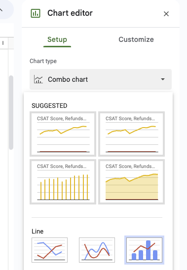
Choose Chart Type: In the right sidebar, you'll see a Setup menu. Click on the "Chart Type" drop-down and select "Combo Chart."
Confirm Series: Make sure all three series are visible:
Customize Tab: Now, go to the "Customize" tab and click on the drop-down arrow next to "Series." Select the "Refund Amount Series" and change its Axis to the Right Axis. For the other two series (CSAT Score and Refunds CSAT Score), ensure they are set to "Axis > Left Axis." If not, select them and adjust their values accordingly.
By following these steps, you align the CSAT and Refund CSAT on the left axis and place the Refund Amount on the right axis, allowing them to overlap in the chart even though they have completely different ranges/values.
Congratulations! You've successfully created your first Combo Chart! 📈
If you have any questions, please tag me in a comment or pop me a message and I'll try to support 🤓


